Critical Change Baystate’s New ED Is Focused on the Patient Experience
Ann Maynard acknowledged that visitors to Baystate Medical Center’s new, 73,000-square-foot emergency department will likely spend less time there, on average, than they would in the 17,000-square-foot facility it is replacing.
But getting patients seen, treated, and back out the door in good order is not the overriding mission of the new ED — although that’s certainly a big part of it, said Maynard, a registered nurse and director of Emergency Services for Baystate.
Instead, overall patient satisfaction is the guiding principal behind every facet of the new facility — from the colors on the walls to the sheltered ambulance bays; from the private rooms (each with their own sink and supplies) that replace bays with sliding curtains in the old ED, to a more comprehensive triage system.
“We’ve focused on comfort and privacy as much as expediency,” said Maynard, stressing repeatedly that so-called wait times will be improved. “This is not about time, but what’s happening while you’re waiting. Now, you’ll be in a private room with your family, and not in a hallway where people have to move your stretcher to get to a sink.”
Maynard made these observations and many others as she gave BusinessWest a tour of the expansive, $45 million ED, which officially opened its doors on Dec. 3.
Part of what was known before it was built as the Hospital of the Future, the ED was christened at an elaborate grand opening on Nov. 30 that was attended by more than 200 people and featured comments from Maynard; Baystate President and CEO Mark Tolosky; Richard Steele, chairman of the Baystate board of directors; and Niels Rathlev, chairman of Emergency Medicine for the system.
Among the many common threads among those speeches were the phrase ’state of the art,’ the clear need for such a facility within the community, and the fact that the new ED came about through exhaustive research and the feedback of not only who will work in this unit, but those who will be treated there.
This point was stressed repeatedly by Maynard as she took HCN through the new ED’s six ’pods,’ waiting rooms, and other facilities a few days before the unit opened its doors.
“When we started this project, there were some guiding principles,” she said. “When we made decisions, we made them looking through the patient’s eyes and the staff’s eyes. And we always went back to patient safety — with each decision we made, we started with, ’how will this affect our patients?’”
And this philosophy helps explain everything from the tiny, low-to-the-ground toilets that sit beside standard units in the pediatric pod, to the laptops in the children’s waiting room, to an expedited registration process for patients.
For this issue, HCN takes readers on their own tour of the facility, in a figurative sense, and explains the many thought processes behind its design and operating model.
Space Exploration
Maynard said the new ED was originally scheduled to be a big part of phase 2 of the Hospital of the Future, but was eventually moved into what she called the “fast lane” because of the basic inadequacy of the facility it has replaced.
The now-former ER, last updated in 1985, was originally designed to treat roughly 60,000 patients a year. In recent years, however, it was administering services to roughly twice that volume, and with obvious negative impact on overall patient experience.
“Just that constraint alone needed to be fixed,” she said, referring to the ED’s footprint. “We were really limited by the space we were in.”
The new ED is not merely almost four times larger than the old one in terms of square footage, said Maynard, noting that, in addition to more room — 94 private rooms compared to 48 bays — it has a design and individual components chosen to both create efficiencies and improve the overall experience for patients and family members.
And as she talked about how it all came together, Maynard said those designing and building the new ER took the simple yet effective approach of putting themselves in the shoes of both the ED staff member and the patient, whether that individual was 4 or 94.
“We’ve had family-advisory groups that we’ve met with and had discussions with about their visit with us and their perception of the experience,” said Maynard, adding that those perceptions, perhaps as much or even more than the actual care administered, played into how the new facility was designed. “People think things like, ’does anyone know I’m here?’ and ’does anyone care that I’m here?’
“We save lives every day in this emergency department,” she continued. “And those people send us thank-you notes. It’s the patients who wait for five or six hours that became frustrated because of the process that we had in place.”
The new ED was designed, in essence, to make such questions, and such frustrations, relics of the past, she said, adding that she was part of a large team that visited other emergency departments, conducted extensive research, and asked myriad questions of patients and staff to design a facility that will serve the system and the region for decades to come.
That team included ED staff and leadership, the architect firm hired to design the facility (Boston-based Steffian Bradley, which also designed the MassMutual Wing, another part of phase 1), and others within the system. This group visited other ERs of comparative size to Baystate, which is the second-largest facility in the state.
Those visits, and the answers to the questions put to staff, patients, and family, helped inspire a design and operating system that Maynard believes will address those issues of comfort, privacy, and expediency.
The feedback Maynard described has led to what she considers some vast improvements over the old emergency facilities.
And perhaps the most visible example is the pediatric pod, with its Disney-inspired characters on the walls in the waiting area, bright colors, counters shaped like lilypads, and even a strobe-light effect in the imaging room, designed to take the patient’s mind off what they’re going through.
Let Kids Be Kids
Such features, in addition to the dedicated entrance, waiting room, and triage area, make sense on a number of levels, said Maynard, adding quickly that young children are not adults, nor should be treated like them — or near them — in the emergency department.
“Children should not have to compete for the adult resources or with the adult resources,” she explained. “Meanwhile, parents don’t want want to have their children exposed to what we see in the adult pods.”
The children’s waiting area has a reading area and computers, and each private room in that pod has a television set, she continued, adding that all of these features are designed to help make what is usually a traumatic experience for young people less so.
In their own way, each of the other pods — designated by letters and designed for various levels of emergencies — embodies that basic philosophy of the children’s unit, meaning a patient-focused approach.
The private rooms are good examples, she said, adding that, in addition to a sink — there were only 14 sinks total in the old ER — each one has its own supplies, chairs for family members, and adequate privacy. What’s more, staff members in each pod face these private rooms, where in the old ED, they had their backs essentially turned to patients.
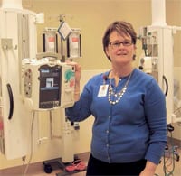
“If you’re a patient and you’re on one of these stretchers, I [the attending nurse] have a computer I can do my documentation with, a monitor … all the supplies and equipment I need to take care of the patient are right here in this room,” she said while taking HCN into one of the units in Pod B. “This makes things much more efficient when it comes to time — I no longer have to leave the room to get anything; it’s already here.”
The supply carts in each room, she went on, are stocked to handle the needs of four or five patients, which is about how many times a room will be turned over each day, saving more time for those attending to patients.
And these are just some of the elements that should enable the new ER to create quicker, as well as better, stays for the patients, said Maynard, adding that several measures and design features will likely improve wait times.
“From the minute the patient walks in the door, the focus is on how we get the patient to the doctor to start the treatment as quickly and safely as possible,” she said, adding that this process starts with triage, or, to be more specific, streamlining that process.
At Baystate’s new ED, triage and registration (known as ’quick reg’) are essentially combined, with a nurse handling both duties, said Maynard, adding that treatment essentially begins at the point of triage.
Meanwhile, nurses can also handle protocol orders — blood draws, urine samples, and other matters — so that, by the time a patient sees a doctor, results from those tests are back.
As she talked about the improved triage system, she referenced something known as the emergency services index (ESI), which rates patients’ situations on a scale of 1 to 5.
That highest number might be assigned to someone with a minor rash, she explained, while a 1 would be an individual “with the potential of dying,” a patient with severe trauma, for example, or one going into cardiac arrest.
The pods in the adult portion of the new ED are arranged to treat people at various spots on the ESI spectrum, she explained, adding that, in the old ER, there was far less segregation, and therefore less efficiency.
To the Future
Maynard told HCN that the new ED will not magically reduce the waits in the ER from four or five hours down to one or two.
It will still take time to properly and safely administer care, she stressed repeatedly, and the new facilities were designed to create a better, more efficient, more patient-friendly environment in which that can happen.
All this is certainly worth celebrating, and that’s exactly what the Baystate community did on Nov. 30.


Comments are closed.